
Table of Contents
Dashboard design principles.
These are the guiding light that helps designers creative effective and user friendly data visualization interfaces.
Whether you are designing a business dashboard, a data analytics dashboard, or a dashboard for any other purpose, understanding and applying these principles can greatly enhance the user experience and improve data interpretation.
So, what are these principles? Well, if you want to learn about dashboard design principles, this blog is for you.
Here, we shall be discussing some of the top and most useful principles that every designer should know. Therefore, with this being said, let’s get right into it:
What is Dashboard Design?
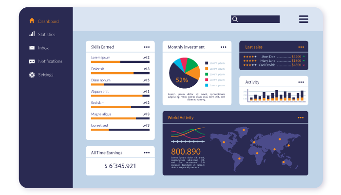
Before we dive into dashboard design principles, let’s first clearify what is a dashboard design.
Well, as the name suggests, it refers to the process of creating visual interfaces that present data in a concise, intuitive, and visually appealing manner.
Dashboards consolidate complex data sets into easily digestible visualizations such as charts, graphs, tables, and other interactive elements. In addition, they serve as a centralized hub for monitoring, analyzing, and making data-driven decisions.
So, this is what dashboard design is. Now, people often ask, why are they important? Well, if you have the same question, let’s aner it in the next section.
Dashboard Design Importance: Statistical Point of View
Statistics never lie, that’s why let’s see how important dashboard and dashboard designs are. This will further help us understand importance of dashboard design principles later down the line.
Speaking of which, statistics are, as mentioned below:
- According to a study by Aberdeen Group, companies that effectively use data visualization in their dashboards achieve 47% higher year-over-year revenue growth compared to their counterparts who do not emphasize data visualization.
- A survey conducted by Tableau revealed that 90% of business leaders believe that data-driven decision-making is crucial to drive business success. Well-designed dashboards play a pivotal role in facilitating data-driven decision-making processes.
- In a study conducted by Nielsen Norman Group, it was found that users form their first impressions of a website or dashboard within the first 50 milliseconds of exposure. This highlights the importance of a visually appealing and user-friendly dashboard design.
- According to a report by Dresner Advisory Services, 78% of organizations consider data visualization as either “critical” or “very important” for their business operations. Effective dashboard design principles contribute to creating impactful data visualizations.
By incorporating these additional principles and relevant statistics into your dashboard design, you can further enhance the user experience, promote data-driven decision-making, and maximize the value derived from the data presented in the dashboard.
But did you know that there are different types of dashboard? Well, let’s discuss them in detail below.
Types of Modern Dashboard

Based on Dashboard UI Design and their function, they can be divided into different category. So, before discuss the dashboard design principles, we shall go through these different types.
Analytical Dashboards
These dashboards focus on data exploration and provide users with interactive tools to analyze trends, patterns, and relationships in the data.
Operational Dashboards
Operational dashboards are designed to provide real-time insights into key performance indicators (KPIs) and operational metrics. They often include gauges, meters, and status indicators to facilitate quick decision-making.
Strategic Dashboards
Strategic dashboards are used by executives and managers to track high-level business metrics and monitor the overall performance of an organization. They typically provide a summary view of critical data and support strategic decision-making.
Tactical Dashboards
Tactical dashboards focus on specific functional areas or departments within an organization. They provide detailed insights into departmental metrics, performance goals, and progress towards achieving objectives.
Now that you know the different types of dashboard. Let’s look at some of the top dashboard design principles.
Top Dashboard Design Principles
Whether it is dashboard or design or any other form of UI/UX design, principles are what works as the pole star.
In this section of the blog, we shall be going through some of the top and most useful dashboard design principles for designers. Let’s get started with the most important one:
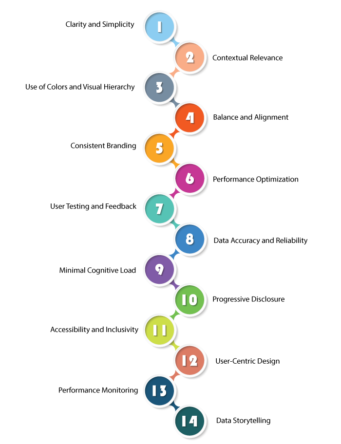
Clarity and Simplicity
This is one of the most important design principle for dashboard design UX UI, but also one of the most simple one.
It stays that, a design should always keep the design simple and focused, emphasizing clarity and ease of understanding.
In addition, developers should also avoid unnecessary complexity and strive for a minimalist approach.
Contextual Relevance
This one is a little more technical than the last one.
It says that, you should tailor the dashboard to the specific needs and goals of the target audience.
This can be done by presenting data in the appropriate context to facilitate meaningful insights and actions.
Use of Colors and Visual Hierarchy
Here, a secret that all product design companies know and you should too!
A designer should employ a consistent color scheme and use color strategically to highlight important information.
Moreover, they should also establish a clear visual hierarchy to guide users’ attention to the most critical elements.
This is one of the most important dashboard design principles.
Balance and Alignment
Balance is very important in all things.
Therefore, when it comes to Dashboard design, maintain a visual balance by distributing visual elements evenly. Align elements logically to create a sense of order and structure.
Consistent Branding
We cannot stress this enough, branding is super important when designing anything.
This is something that a lot of brand understands very late in the game, thus leading to app redesign.
Speaking of which, to keep consistent brand imager, apply consistent branding elements, such as logos, typography, and color schemes, to reinforce the organization’s identity and create a cohesive user experience.
Performance Optimization
Whether it is designing or web development, performance optimization is very important.
Therefore, we highly recommend to optimize the dashboard’s performance by minimizing loading times, leveraging caching mechanisms, and optimizing queries to ensure responsiveness and real-time data updates.
User Testing and Feedback
It is often said that in the world of development, testing a solution is just as important as creating it.
Therefore, this dashboard design principle suggests all the designers to conduct usability tests and gather feedback from users to identify pain points, optimize workflows, and improve the overall user experience.
As one can assume, this helps maintain quality as well as performance of the dashboard itself.
Data Accuracy and Reliability
Ensure that the data presented in the dashboard is accurate, reliable, and up-to-date.
And implement robust data validation processes and establish data governance practices to maintain data integrity.
This ensures data correctness and overall reliability of the platform, thus, making sure the final solution is satisfactory.
Minimal Cognitive Load
This is rather advanced one of the dashboard design principles. It helps reduce cognitive load by presenting information in a digestible format.
Moreover, it also helps avoid overwhelming users with excessive data, complex visualizations, or irrelevant information.
While doing this, the designer should also, prioritize the most important insights and present them in a concise manner.
Progressive Disclosure
Employ progressive disclosure techniques to reveal additional details or data as users interact with the dashboard. This approach helps prevent information overload while allowing users to explore deeper insights when needed.
Accessibility and Inclusivity
Design dashboards that are accessible to all users, including those with disabilities. Incorporate features such as screen reader compatibility, keyboard navigation, and color contrast optimization to ensure inclusivity.
User-Centric Design
Put the needs and preferences of the users at the forefront of the design process. Conduct user research, understand their goals and pain points, and tailor the dashboard accordingly to provide a personalized and intuitive experience.
Performance Monitoring
Implement performance monitoring mechanisms to track the dashboard’s responsiveness and loading times. Regularly analyze performance metrics and optimize the design to provide a seamless and efficient user experience.
Data Storytelling
Utilize data storytelling techniques to create narratives and guide users through the data. Craft a compelling and engaging narrative that helps users understand the context, insights, and implications of the data presented.
What Makes a Good Dashboard Design?

You must be wondering how to make a good UI/UX design for dashboard right?
Well, there are many things that you can do to make it right, for instance, considering UI trends, testing, and so on.
But first you need to understand what makes a good design. Therefore, mentioned below are components of a good dashboard design as per dashboard design principles.
Clear and Concise Layout
Clarity is the key to success of dashboard design UX.
A well-designed dashboard should have a clean and organized layout, with intuitive navigation and clear information hierarchy.
Therefore, one should always avoid clutter and excessive visual elements that may distract users from the main message.
Relevant and Meaningful Data
A designer should only Include the most relevant data that aligns with the dashboard’s purpose. And display data that drives insights and supports decision-making.
This dashboard design principle is something that will take you long way.
So, these are the Dashboard design principles that every UI/UX dashboard should follow when creating dashboard design.
Conclusion
Understanding and implementing dashboard design principles are vital for creating impactful and user-friendly data visualization interfaces.
By following the principles outlined in this blog, you can design dashboards that effectively communicate data, facilitate decision-making, and enhance the overall user experience.
Remember, a well-designed dashboard not only provides valuable insights but also empowers users to take actionable steps based on data-driven analysis.
Speaking of which, if you are someone who wants to create an amazing dashboard but don’t know how to, all you need to do is contact a market leading designing company like WeAppIt Right.
FAQ
Dashboard design principles are guidelines and best practices used to create effective and visually appealing dashboards. They help organize data, prioritize information, and present it in a way that enables users to make informed decisions quickly and easily.
Dashboard design principles are important because they improve user experience, enhance data comprehension, and facilitate effective data analysis. They help designers create dashboards that are intuitive, visually appealing, and provide users with actionable insights.
Some key dashboard design principles include simplicity, clarity, consistency, relevance, hierarchy, and interactivity. Designers should focus on using clear and concise visualizations, organizing information logically, and providing interactive features for exploration.
Achieve simplicity by avoiding clutter, using minimalistic design elements, and focusing on the most important information. Remove unnecessary details and visual distractions, and keep the overall design clean and uncluttered.
Clarity in dashboard design refers to the ability of users to understand and interpret the information presented. Use clear and descriptive labels, choose appropriate visualization types, and ensure that the data is easy to read and comprehend.
Consistency ensures a cohesive and intuitive user experience. Use consistent color schemes, fonts, and layout across different dashboard elements. This helps users navigate the dashboard easily and understand the relationships between different components.
Ensure relevance by focusing on the specific needs and goals of the dashboard users. Only include data and visualizations that are directly related to their tasks and objectives. Avoid unnecessary information that may distract or confuse users.
Hierarchy refers to the arrangement and prioritization of information within a dashboard. Use visual cues such as size, color, and placement to highlight important elements and guide users’ attention to the most critical data and insights.
Interactivity allows users to engage with the data and explore different perspectives. Incorporate interactive features like filters, drill-downs, and hover effects. This empowers users to investigate trends, discover insights, and customize the dashboard to suit their needs.
Common mistakes to avoid include overcrowding the dashboard, using excessive colors or complex visualizations, neglecting user feedback, and failing to align the design with the users’ goals and requirements.
Ravi is an SEO Expert at We AppIt Right, specializing in crafting data-driven strategies that enhance search visibility and drive sustainable growth. With strong expertise in technical SEO and search algorithms, he ensures every digital presence is optimized for performance and long-term success. Passionate about innovation, Ravi continuously explores emerging SEO trends like AEO, GEO and analytical techniques, staying ahead of industry changes to deliver impactful results.


No Comments
Comments are closed.